Click here to download the resulting font. Use it at 16px height.
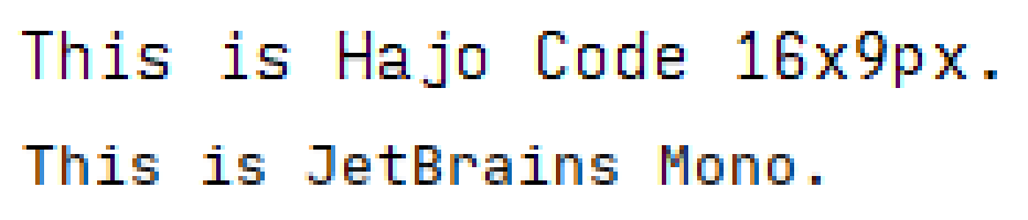
FYI both fonts are scaled so that I can fit 42 lines of code inside IntelliJ maximized on my 1920x1080 screen. As the result, both fonts are rendering at 16px glyph height and with a 120% line height, meaning 3 gap pixels in between lines. As you can see, the default IntelliJ font antialiasing is turned on and it’s using GDI ClearType.
You can clearly see the different design intentions. For my font, I decided to sacrifice the space around diacritical marks and use rather flat descenders to make things easy to read. That’s why my font looks taller at the same glyph height: It has less whitespace above and below the letters. Also, I gave up on having nice round glyph shapes in exchange for a crisper fit into the pixel grid.
I hope nobody at IntelliJ is offended by my title choice. I love their IDEs, but I find their default font very challenging to work with. And it’s not just them. Every IDE on Windows (and the Terminal) defaults to using a blurry mess as the default font.
Why make yet another font?
Recently, I looked at old screenshots from Visual Studio 6 on Windows XP and I thought:
“Wow, that font looks so big and crisp and clear and readable!”
And then I remembered an article I recently read on how technology is getting worse and worse because the people who truly understand how things work under the hood are getting old and retiring, leaving only the people who grew up doing things a certain way without ever questioning why.
Anyway, most modern TrueType fonts look really nice when you print them out, and they are OK to work with on a retina MacBook, but they become a blurry mess when you’re using them on a more or less normal Windows PC with Full-HD screen.
How did we get there?
Back in the day, people used bitmap fonts, so someone chose by hand how brightly a given pixel should be illuminated. Those fonts were super crisp and clear, but they only worked at exactly one font size.
Then people started using vector fonts, like TrueType or OpenType, which can be printed nicely at different resoltions. But to make them display well on the relatively few pixels that a screen has, the characters needed to be distorted to align with the pixel grid, which is called hinting and used to be done by hand.
LCD screens display color by having a color filter array on monochrome pixels at 3x the horizontal resolution. Someone smart at Microsoft had the idea to use this fact and render vector fonts at 3x the horizontal resolution, then encode things into colors to make it display much clearer on an LCD screen. Quite descriptively, they called this technology ClearType and obviously it only worked well on LCD screens where the order of the colors in the filter array matches what the software expects.
But ClearType didn’t work well with hinting, because if things align with the pixel grid in the first place, then you’re not getting any advantage of having 3 virtual pixels per each physical pixel. So with the introduction of ClearType, the Windows font renderer started to ignore horizontal hinting.
A while later, people complained about the color fringing (caused by ClearType) and it was also difficult to accelerate things on GPU because ClearType made the rendering of the same font with the same text and the same parameters position-dependent by relying on the order of the physical pixel grid inside the screen. So then ClearType subpixel rendering was abandoned and replaced by regular antialiasing.
Sometime in between, someone at Apple decided that they like the slightly blurry look of printed text more than the harsh crispy edges of digital text, so they skipped all that ClearType intermediate and directly went with regular antialiasing.
And that leads us to today, where font renderers on all major platforms ignore horizontal hinting and in many cases also vertical hinting and they (badly) try to make up for it by rendering at a higher resolution and then smoothing things when they scale it down to the screen’s final display resolution.
But since the BluRay arrived 15 years ago, computer screens have remained at roughly 15" Full HD, which means that just like back then, a typical font in a typical text editor has like 9x16 pixels of drawing area. Back then, we did hand-crafted hinting magic to work around those technical constraints. Nowadays we just don’t care and render unaligned glyphs and blur the sh*t out of it.
That’s how we ended up with fonts being objectively more blurry and less crisp today than they were 15 years ago.
How do we fix this?
I’m glad you asked. In my opinion, “the enemy” here is all the messy subpixel rendering going on in various font rendering engines. Using a true bitmap font is technically not possible anymore, but we can simulate it by creating a vector font which compensates for the subpixel shenanigangs done by font rendering engines so that the vector shapes in the end produce crisp and clear pixels again.
TensorFlow “AI”
Since everybody loves it these days, of course I had to use AI. You could also call it “linear regression” but that’s such a 2010 term :p
So I used FreeType to render a lot of TTF fonts both at a very high resolution and at a low resoltion. Then I trained a U-NET GAN to predict the high-res image when given a low-res image.
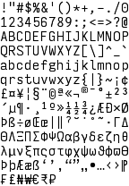
Then I just painted the bitmap font that I want by hand:
And I let the GAN predict how the high-res glyphs would need to look so that if those vector glyphs are rendered by an engine like FreeType, the result will look as much as possible like my hand-drawn character bitmaps.
The resulting PNG is here. Note the staircase effect on diagonal lines, which is a deliberately generated artifact to make sure these areas are filled to exactly the right percentage to match the pixel brightness that I defined in my low-res bitmap font.
Wrapping things up
I then imported the resulting glyph image into FontLab 7, set up metadata, and let it autogenerate compound glyphs (e.g. Ä out of A and “). I then used the automated FontLab tools to generate italic and bold variants out of my regular glyphs.
And that’s the final font :)
Here’s the download again. Use it at 16px height.
Please note that this font will only render as intended at exactly 16 pixels height. And while the font certainly feels much larger, it actually still fits 43 lines of source code onto my screen, so the effective line height is identical to the visibly much smaller JetBrains Mono font.
Your font is ugly!
So what? I see this as a tool, similar to a hammer.
My job is reading, writing, and modifying text. Readability on a screen is my top concern.
That’s why I want the font to be big and crisp and clear and to have easily distinguishable letters. Did you notice that I deliberately made 1iIl O0 all different? Sure, I like the look of a straight l more, but then it’s too similar to 1 or I. Also, a and e aren’t symmetrical, because like this they are more visibly distinct. And the j deliberately has an oversized angle to the left and a lower dot, to make ij mixups in for loops less likely. Also, dbqp are all slightly asymmetric, to make them more distinct. And the 5 is extra edgy, to make it more different from the 6. Similarly with 7 and 9.
I designed this font to make my job easier, not to look good on printouts.